Human Development Index Lamp
University · Created during my 3rd semester in 2018 · with Hendrik Dockhorn
The "Human Development Index Lamp" visualizes human development all over the world by depicting it's three indicators: life expectancy, education and income per capita and taking them into 3D Space.
Categories:
Information Visualization
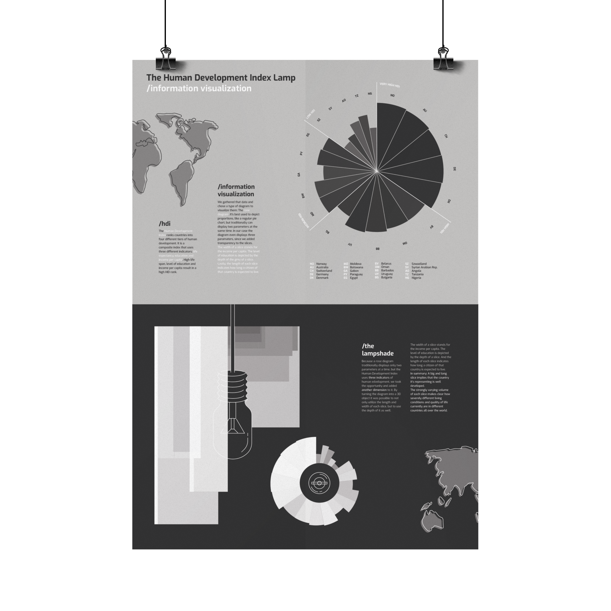
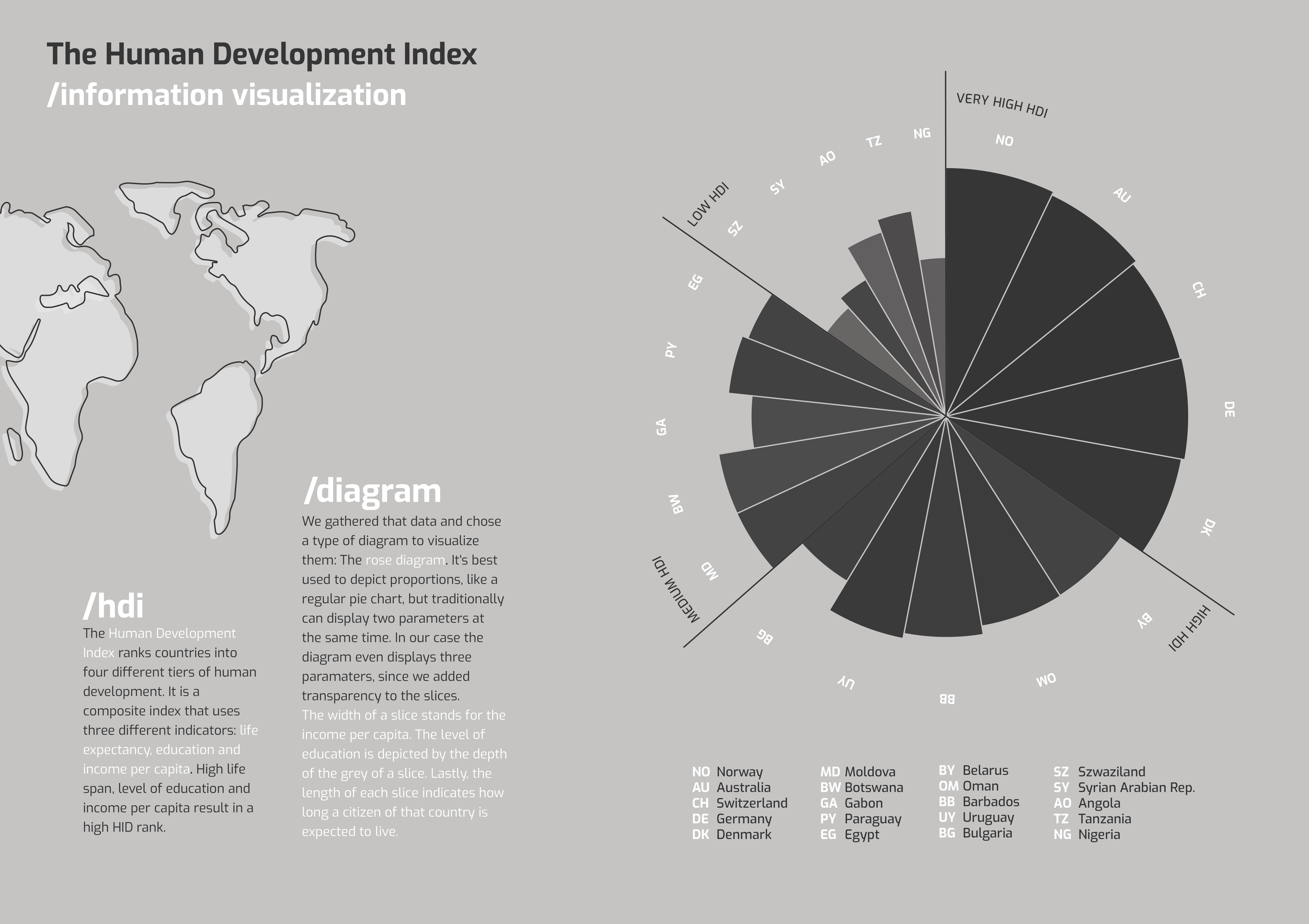
The Human Development Index ranks countries into four different tiers of human development. It is a composite index that uses three different indicators: life expectancy, education and income per capita. High life span, level of education and income per capita result in a high HID rank.
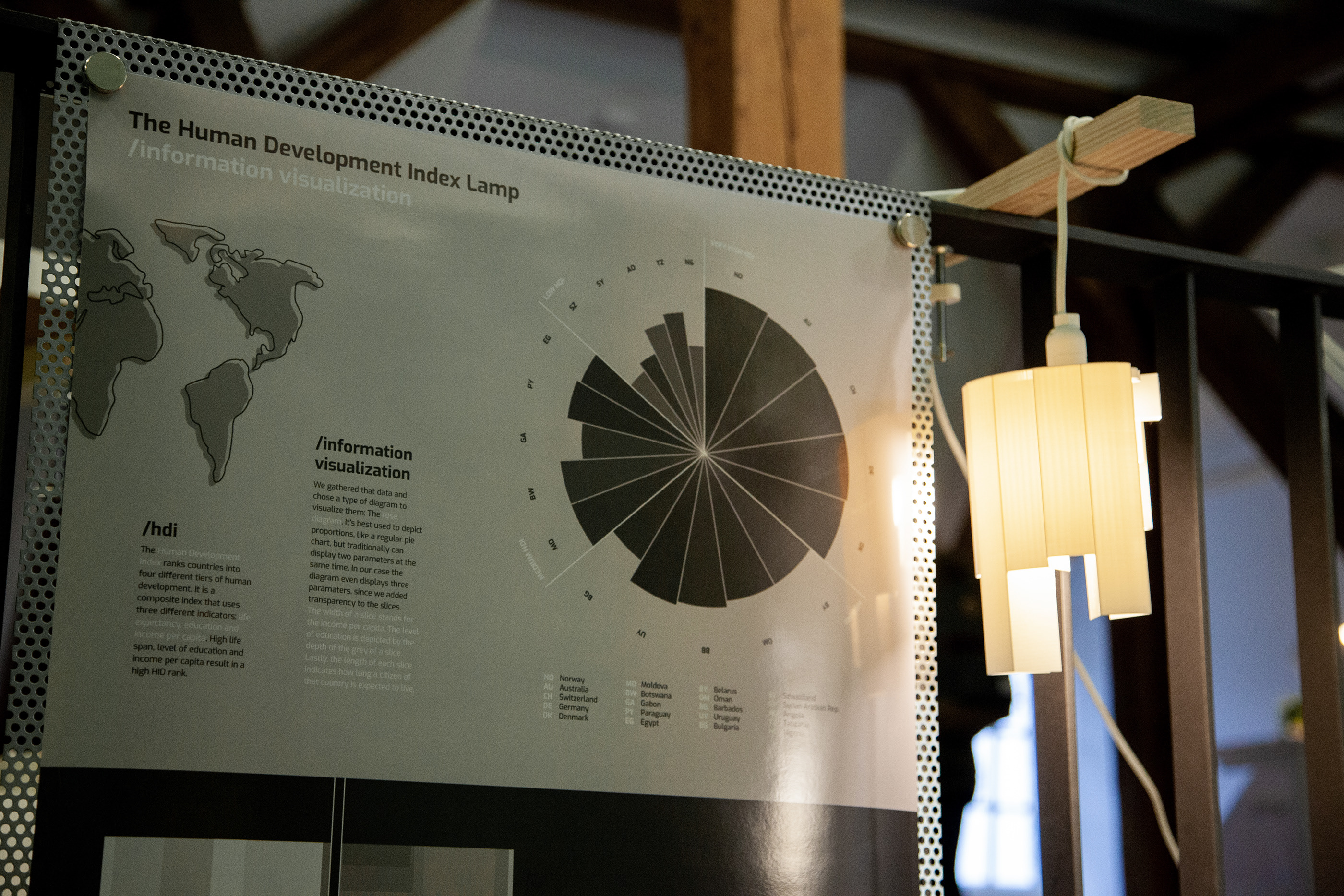
We gathered that data and chose a type of diagram to visualize them: The rose diagram. It‘s best used to depict proportions, like a regular pie chart, but traditionally can display two parameters at the same time. In our case the diagram even displays three parameters, since we added transparency/depth to the slices. The width of a slice stands for the income per capita. The level of education is depicted by the depth of the grey of a slice. Lastly, the length of each slice indicates how long a citizen of that country is expected to live.
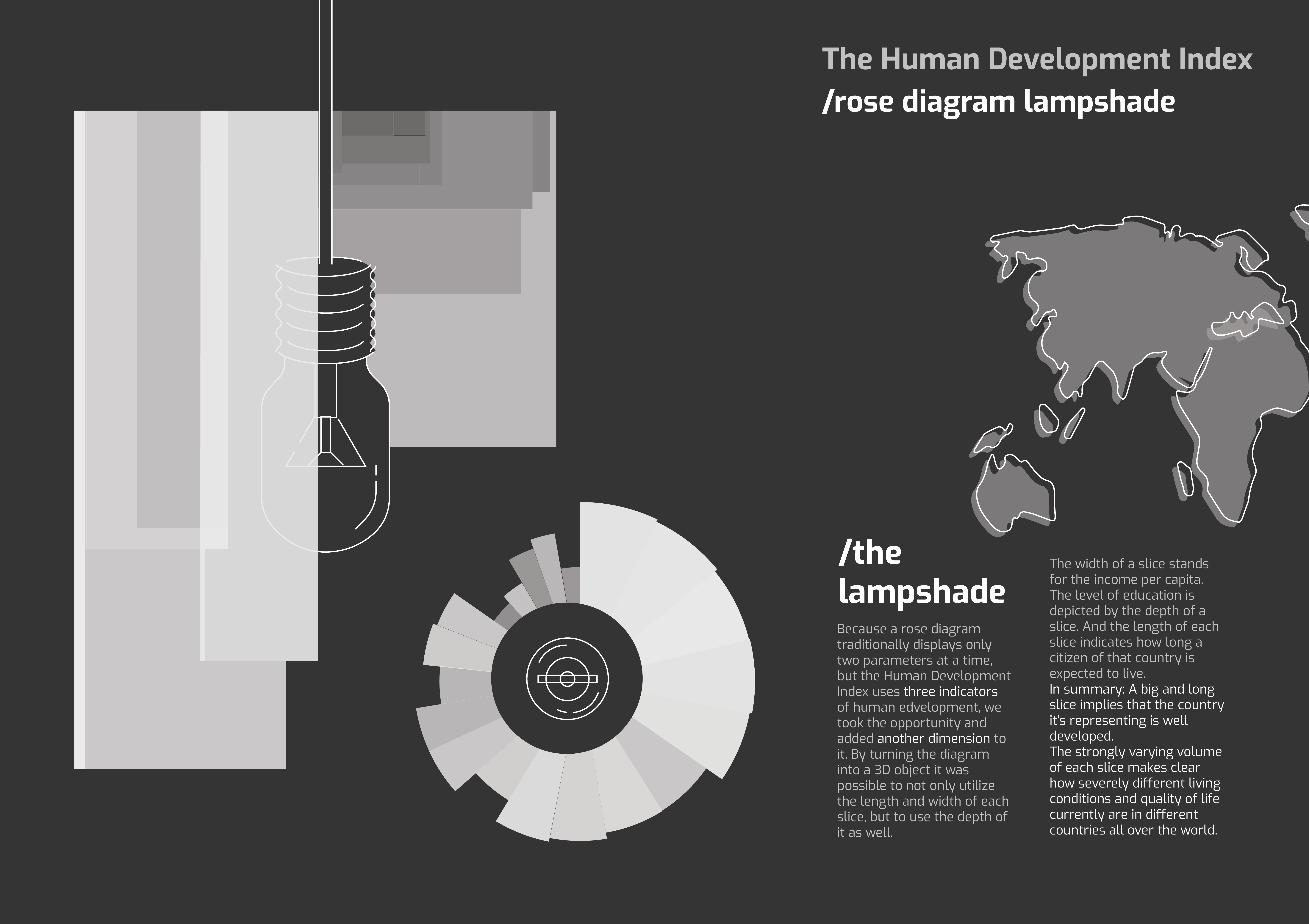
Because a rose diagram traditionally displays only two parameters at a time, but the Human Development Index uses three indicators of human development, we took the opportunity and added another dimension to it. By turning the diagram into a 3D object it was possible to not only utilize the length and width of each slice, but to use the depth of it as well. The width of a slice stands for the income per capita. The level of education is depicted by the depth of a slice. And the length of each slice indicates how long a citizen of that country is expected to live. In summary: A big and long slice implies that the country it‘s representing is well developed. The strongly varying volume of each slice makes clear how severely different living conditions and quality of life currently are in different countries all over the world.
Because a rose diagram traditionally displays only two parameters at a time, but the Human Development Index uses three indicators of human development, we took the opportunity and added another dimension to it. By turning the diagram into a 3D object it was possible to not only utilize the length and width of each slice, but to use the depth of it as well. The width of a slice stands for the income per capita. The level of education is depicted by the depth of a slice. And the length of each slice indicates how long a citizen of that country is expected to live. In summary: A big and long slice implies that the country it‘s representing is well developed. The strongly varying volume of each slice makes clear how severely different living conditions and quality of life currently are in different countries all over the world.